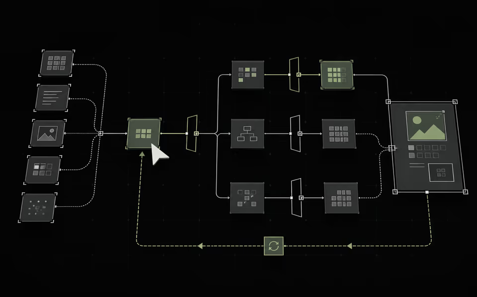
WHAT THIS CHANGES
Three shifts to carry into the next design review.
- 01JOB BEFORE CHAT
Begin with the outcome, not an empty prompt.
- 02SCOPE BEFORE ACTION
Make authority and consequence visible.
- 03CORRECTION BEFORE CONFIDENCE
Trust comes from a cheap way back.
The prompt box is where product thinking goes to hide.
An empty field labelled ‘Ask anything’ looks flexible. It is usually the opposite. It transfers the work of understanding the product, discovering its boundaries, and inventing the right syntax to the person with the least context: the user.
A strong AI experience begins with a job, not a conversation. What is being delegated? Which inputs matter? What may the system change? What must never happen without approval? A useful interface answers those questions before the first token is generated.
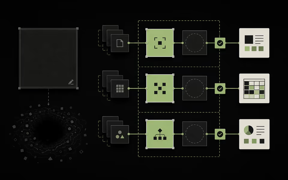
- 01START WITH JOBS
Offer three high-value outcomes instead of infinite possibility.
- 02SHOW THE SHAPE
Pair each job with a strong example and a visible boundary.
- 03STRUCTURE CONTEXT
Collect missing inputs before inviting open prose.
Design the delegation contract before the interface.
Before drawing a screen, write five lines: the goal, the scope, the inputs, the side effects, and the stop condition. That is the product. The chat, command bar, canvas, or form is only how the agreement is expressed.
This changes design critique. Instead of asking whether the response feels magical, ask whether the person can tell what the system understood, what it will do next, and where its authority ends. Magic is delightful for a demo. Predictability is what earns repeat use.
- 01GoalThe outcome being delegated.
- 02ScopeWhere authority starts and ends.
- 03InputsEvidence and assumptions.
- 04Side effectsWhat sends, spends, or changes.
- 05StopThe point of human approval.
AUTHORITY ENDS AT THE VISIBLE STOP CONDITION
Preview consequence, not just output.
Most AI previews show a draft. That is not enough. The dangerous part is often the action wrapped around the draft: who receives it, which source is overwritten, what data leaves the workspace, or which rule becomes automatic.
The preflight pattern is simple: show the plan, affected objects, assumptions, and irreversible steps before execution. Use a diff when the system edits. Use a recipient list when it sends. Use a dry run when it acts across many records. The user should approve the consequence, not merely admire the prose.
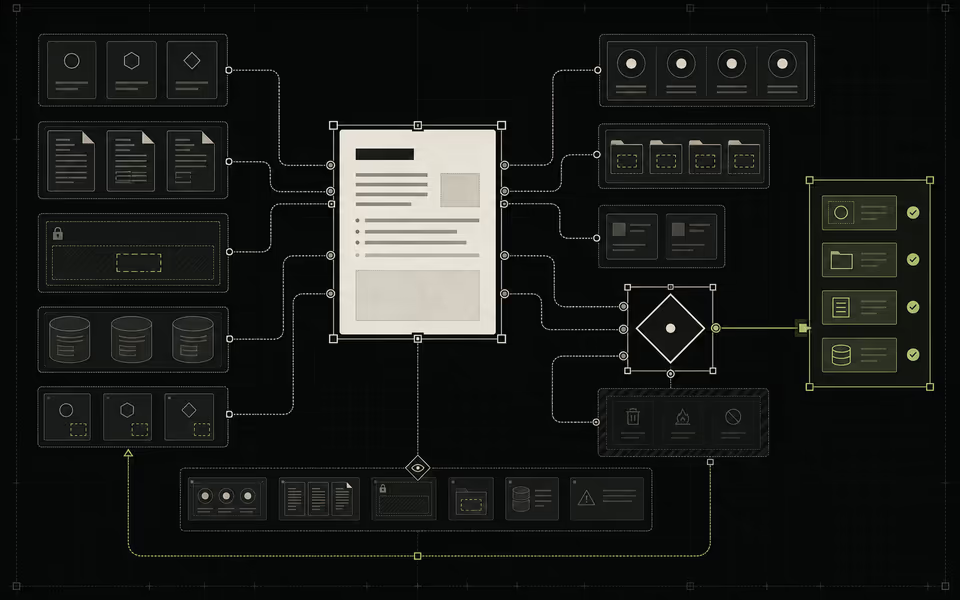
A confidence score is not an explanation.
‘82% confident’ looks scientific and rarely tells a person what to do. Uncertainty becomes useful only when the interface explains why it exists, what evidence supports the result, and which additional input would materially change it.
Expose sources, assumptions, missing information, and contested interpretations. If the system can produce several defensible answers, compare them. If it cannot verify a claim, isolate it. Design uncertainty as a decision aid, not a small grey disclaimer beneath a confident answer.
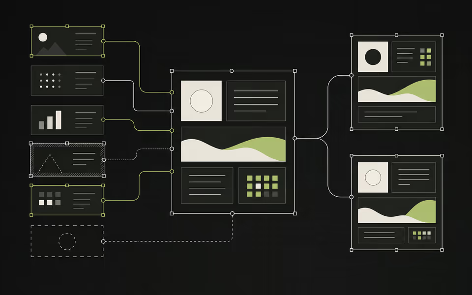
- 01EVIDENCE
Expose what directly supports the result.
- 02RISKY ASSUMPTION
Name the interpretation carrying the most consequence.
- 03MISSING INPUT
Show the gap instead of smoothing it over.
- 04NEXT BEST INPUT
Ask for the one thing most likely to improve the answer.
Design correction, not apology.
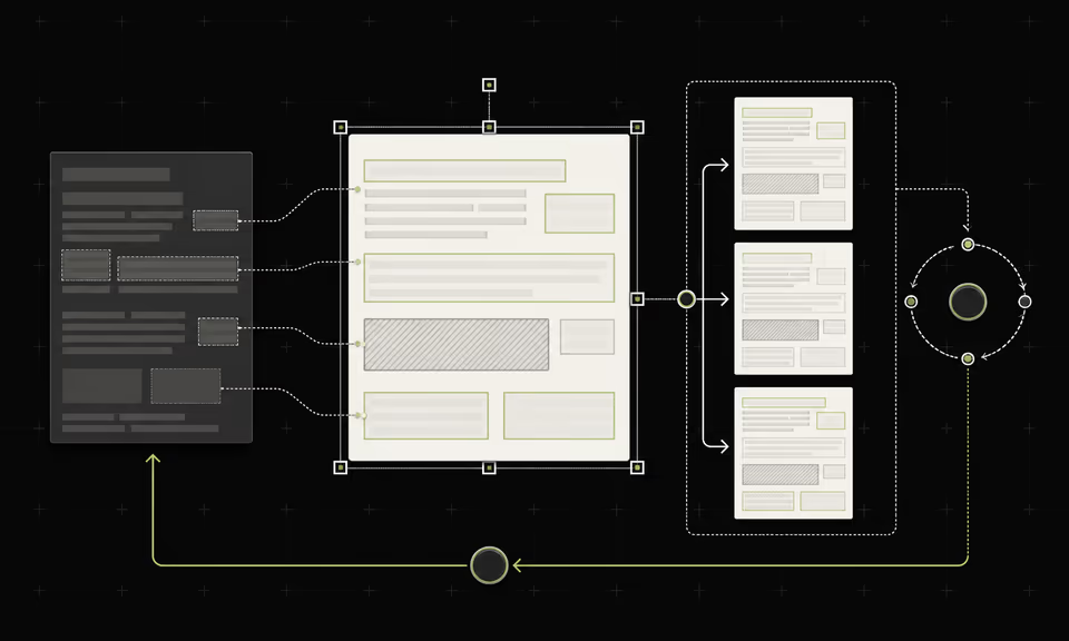
‘Sorry, I got that wrong’ is not recovery. A recovery system preserves the original, makes the change inspectable, and gives the user a cheap path to repair. Edit, retry, compare, restore, undo, and forget are product primitives for AI—not edge-case polish.
Feedback should also change something the user can understand. A thumbs-down icon with no visible consequence is theatre. Let people correct a preference, see what the correction will affect, and reset learned behaviour. Control is the difference between personalisation and capture.
Earn autonomy one rung at a time.
Teams jump from ‘assistant’ to ‘agent’ because automation looks like progress. It is only progress when authority grows with evidence. Start by recommending. Then draft. Then act with approval. Only then allow automatic action inside rules the user can inspect, pause, and revoke.
The best AI interface may contain a chat box. It may not. What it must contain is a legible agreement between human intent and machine action. Design that agreement well and the technology can become more capable without the experience becoming more frightening.

- 01RECOMMEND
No state change.
- 02DRAFT
Private, inspectable, and reversible.
- 03ACT WITH APPROVAL
Explicit review at the boundary.
- 04ACT WITHIN RULES
Visible scope, history, pause, and revocation.
THE ONE-LINE TESTTrust is not created by making AI sound confident. Trust is created by making it safe to disagree with.
SOURCES / FURTHER READING