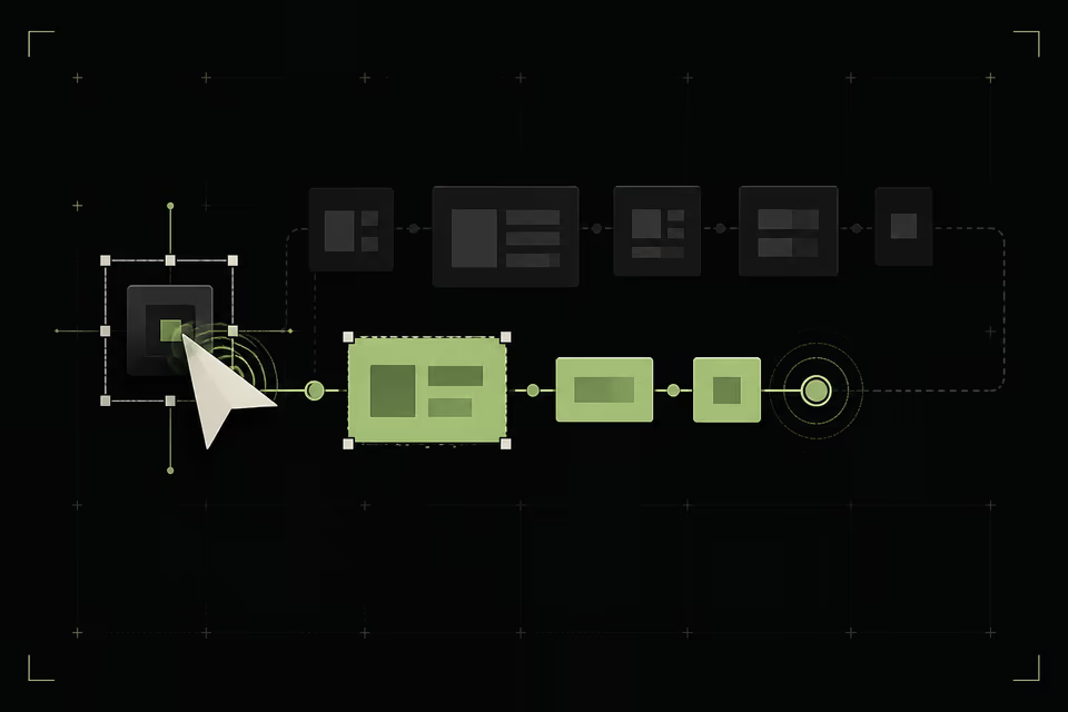
WHAT THIS CHANGES
Three shifts to carry into the next design review.
- 01ACKNOWLEDGE
Reflect the input in the next paint.
- 02DEFER
Move non-critical work off the visible path.
- 03RECONCILE
Finish honestly with server truth.
Teams measure the beginning and ignore the rest of the experience.
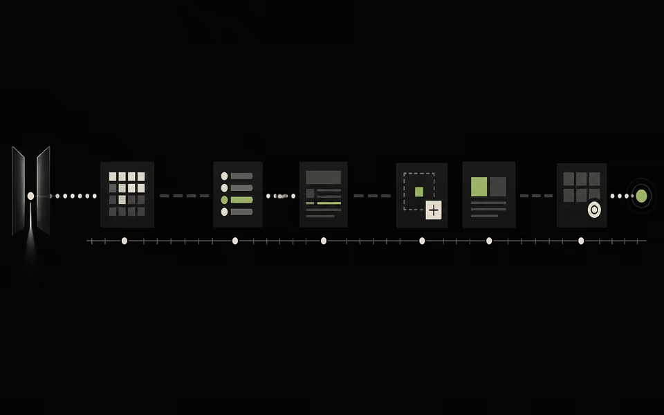
Page load matters. But people spend most of a product session after the page has loaded—choosing, filtering, adding, saving, editing, and waiting for proof that those actions worked. A fast launch followed by hesitant interactions still feels slow.
This is why performance is a design material. Interaction to Next Paint measures the delay people feel between an input and the next visual update. A good experience keeps the 75th percentile at or below 200 milliseconds across mobile and desktop. The metric is technical; the failure is emotional: ‘Did it hear me?’
- 01THE TARGET
Keep the 75th percentile at or below 200 ms.
- 02THE AUDIT
Measure filtering, saving, editing, and recovery—not only launch.
- 03THE FEELING
Remove every moment that asks: did it hear me?
Every interaction needs a response contract.
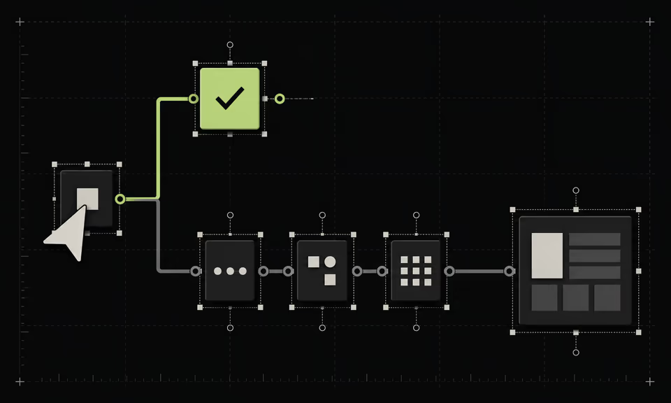
For every meaningful action, define what changes immediately, what may arrive later, and how failure will be repaired. This turns responsiveness from a vague engineering hope into a product requirement that design, code, and analytics can share.
The immediate layer should be visually cheap and semantically honest: pressed, selected, pending, added, moved, or queued. The completion layer can reconcile server truth, refresh dependent data, and confirm success. Silence is never a valid first state.
- NOWAcknowledgeReflect the exact action.
- WAITPendingKeep work legible.
- TRUTHCompleteConfirm the durable result.
- REPAIRFailedPreserve intent and recover.
SILENCE IS NOT A VALID FIRST STATE
Design the next paint and the final state separately.
Many interfaces wait for the entire operation before changing anything. That bundles visual acknowledgement with network, analytics, validation, and persistence. The user experiences the slowest dependency even when the interface already knows what they did.
Split the work. Render the essential response first. Defer non-critical enrichment. If the user adds an item, change the control and count immediately while the request resolves. If they change a filter, show the selected state before the results finish. Responsiveness is often sequencing, not raw speed.
Optimistic UI needs an honesty boundary.
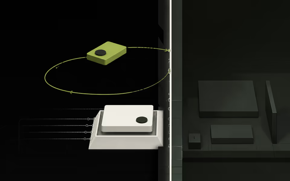
Optimistic interfaces can make low-risk actions feel immediate. They can also manufacture certainty. Use optimism when the action is likely to succeed, reversible, and cheap to reconcile. Pair it with a pending state and Undo so speed never hides responsibility.
Do not optimistically confirm payments, irreversible publishing, destructive deletion, inventory, or permission changes. In those moments, accurate waiting is better than false success. The design question is not ‘Can we make this instant?’ It is ‘What is safe to claim right now?’
- 01SAFE
Likes, local preferences, reversible ordering, and drafts.
- 02CAUTION
Messages, bookings, shared edits, and external writes.
- 03NEVER FAKE CERTAINTY
Money, deletion, access, and legal submission.
Skeleton screens are often loading theatre.
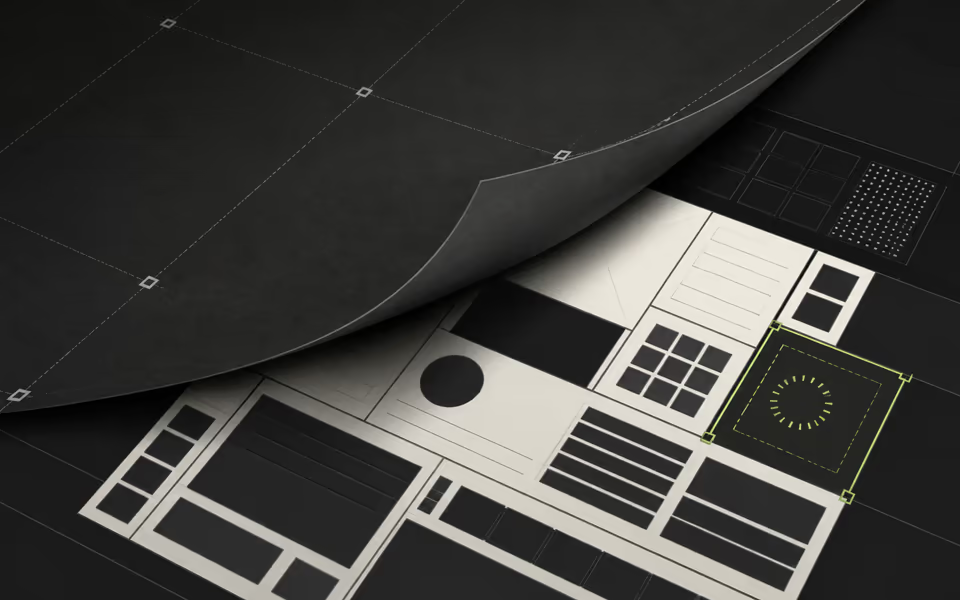
A wall of grey rectangles tells the user that the team knows a layout exists. It does not preserve context, explain what changed, or help anyone decide what to do next. Replacing known content with a skeleton can make an update feel larger and slower than it is.
Keep stable content stable. Reserve geometry to avoid jumps. Update only the region that is genuinely unknown. For short waits, a state change in the triggering control is usually enough. A skeleton is useful when it protects layout and previews real structure—not when it decorates uncertainty.
- 01PRESERVE CONTEXT
Keep known information visible.
- 02RESERVE GEOMETRY
Prevent the layout from jumping.
- 03LOCALISE UNKNOWN
Update only the region still resolving.
- 04EXPLAIN THE WAIT
Let the triggering control carry short pending states.
Motion should explain state change, never postpone it.
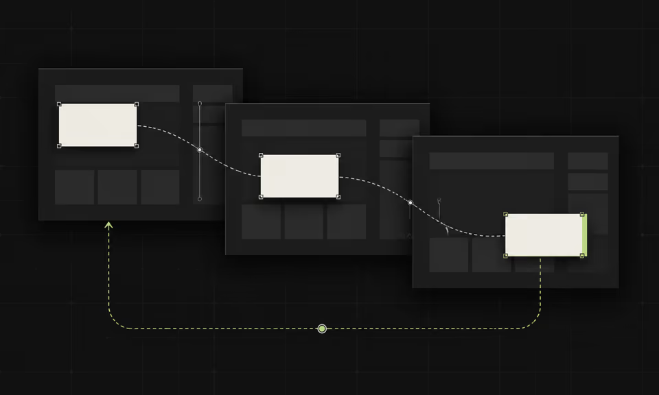
Good motion preserves spatial continuity: this card became that detail, this item moved here, this panel replaced that one. View transitions can now help connect states across views and pages, but the principle matters more than the API. The transition should make the change easier to understand.
Keep it progressive. Respect reduced-motion preferences with alternate choreography—instant state, opacity, and colour—not by removing orientation altogether. And never place a 500-millisecond animation in front of a result that was ready in 80. Delight that blocks intent becomes latency.
THE ONE-LINE TESTThe fastest interface is not the one that finishes first. It is the one that never leaves the user wondering whether it heard them.
SOURCES / FURTHER READING